A Step-By-Step Guide To Making Your Substack Website Aesthetic + Optimized (with screenshots)
This is exactly how I set up my Substack publication and how you can match it!

Hi everyone! I have gotten a few DMs asking me how I created my Substack profile, so I thought why not give you guys a full step by step breakdown of exactly what I did and all the settings I used to make my profile!
Let’s get into it!
If you substack profile still looks like this ^ and you want it to look like this…
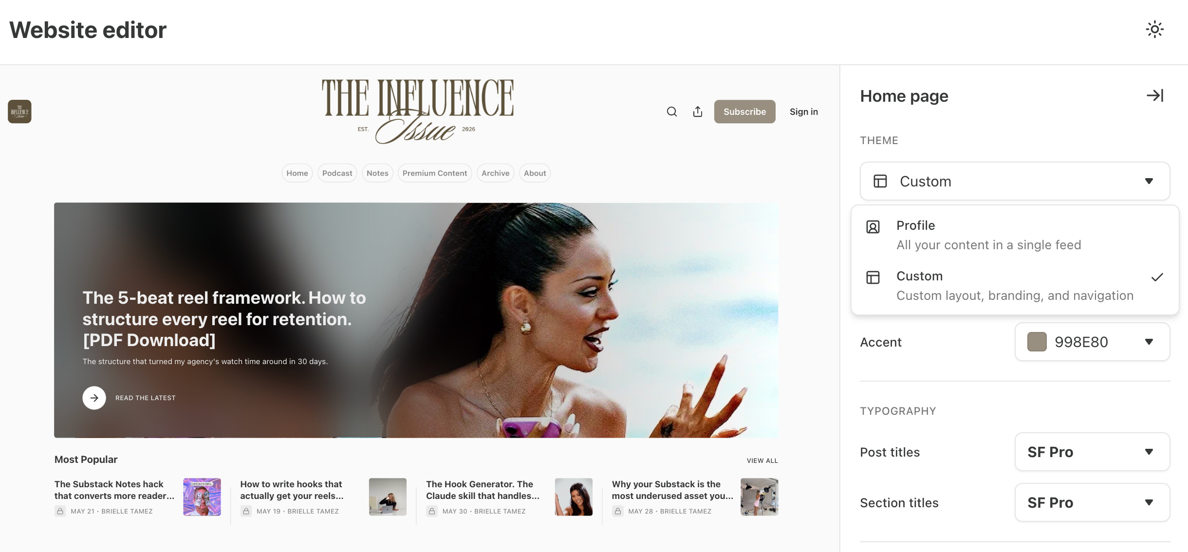
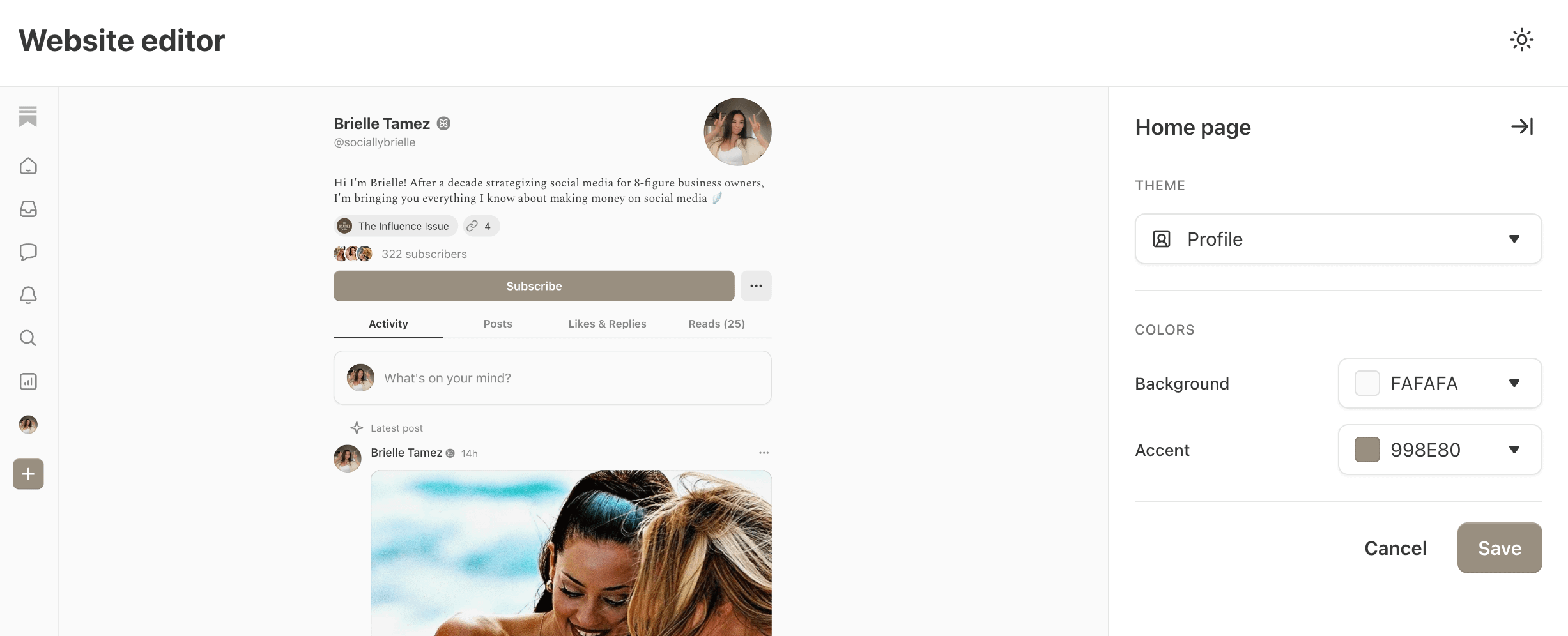
Step 1: Change the theme from profile > custom. This will allow you to create the new look that everyone is using!

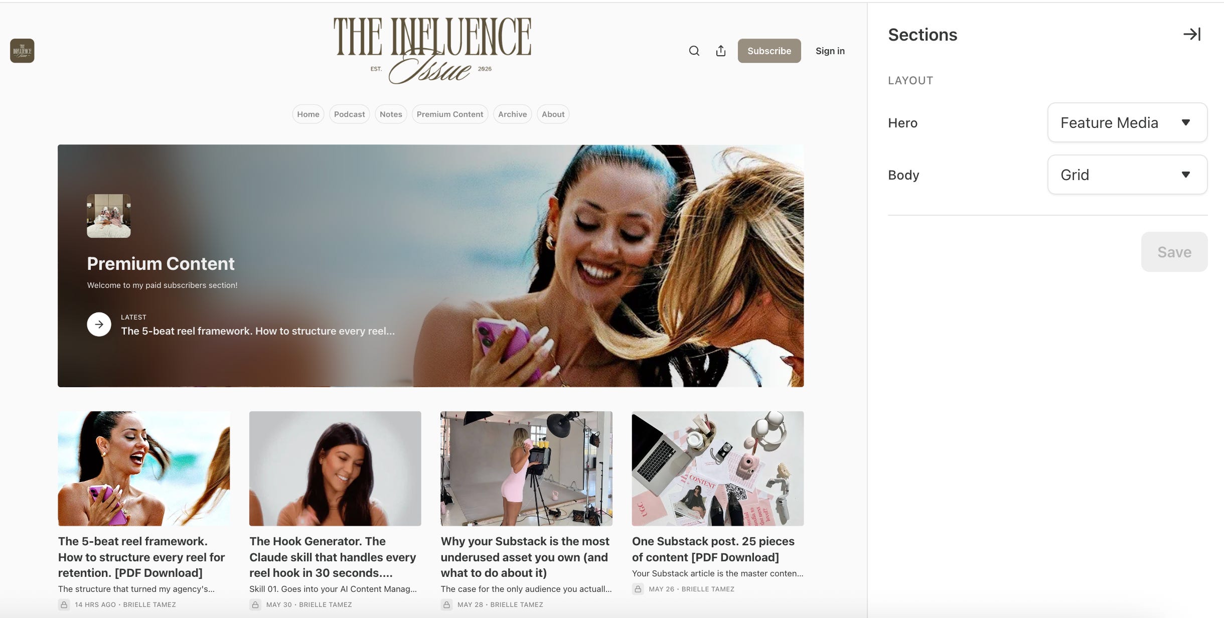
If you want the first section of your Substack website to look like this ^
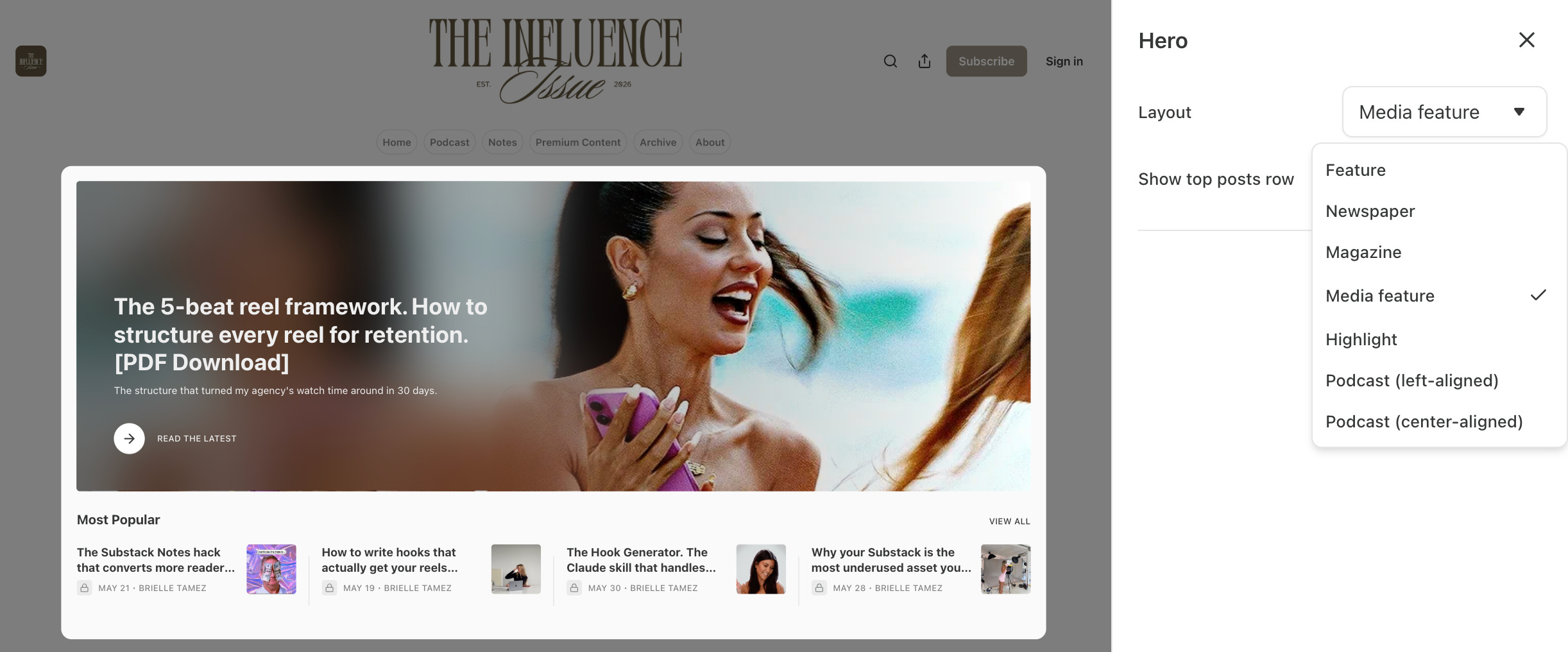
Step 2: Set your HERO section to media feature and your body to grid.
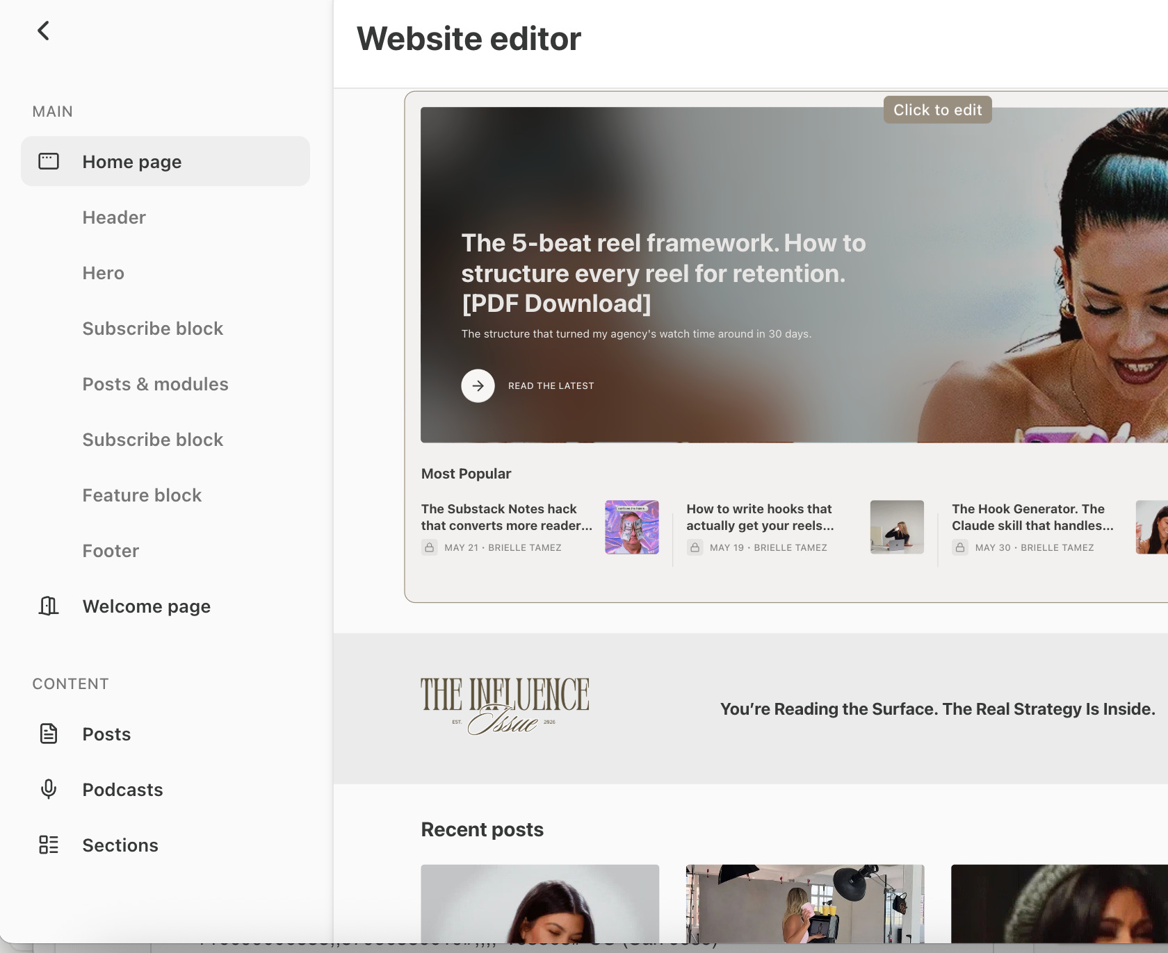
To add new sections to your website like Subscriber blocks and new sections hover inbetween blocks and then click click to add block
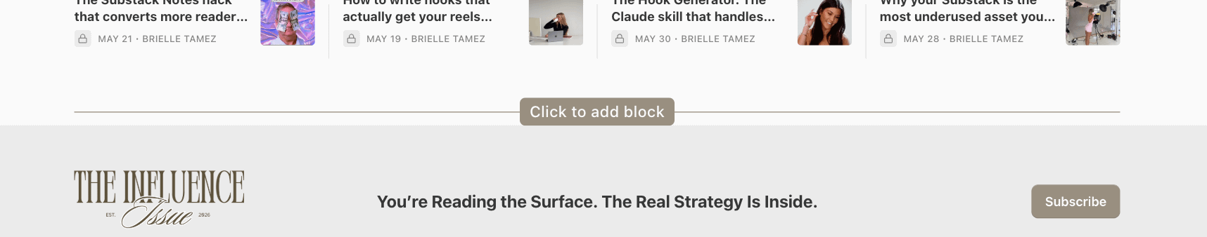
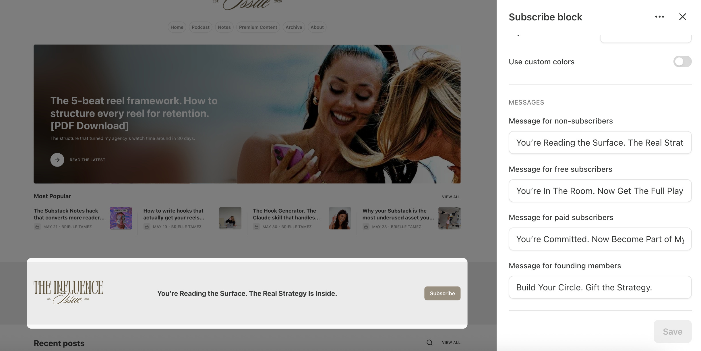
Step 3: Add a new section for Subscriber Block and edit the headlines that show for your different subscriber levels
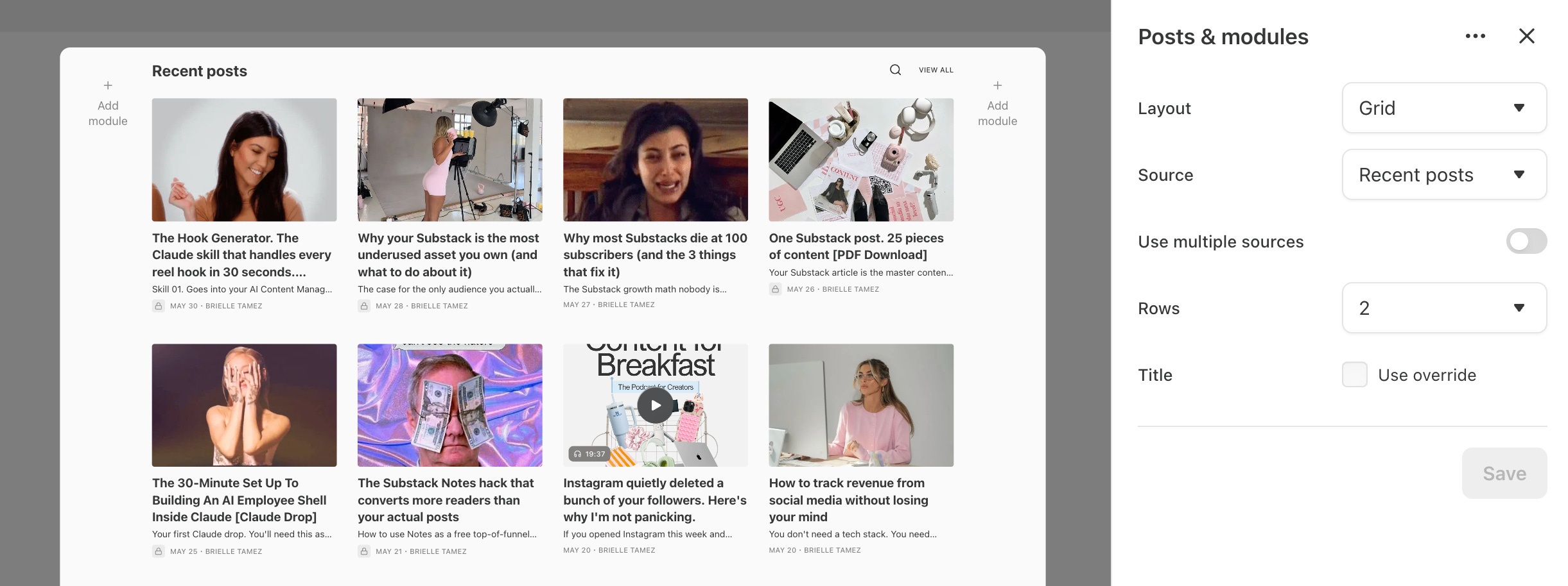
Step 4: Add a new section for Posts & Modules and add your recent posts with a grid layout! I like to do 2 rows for this one.
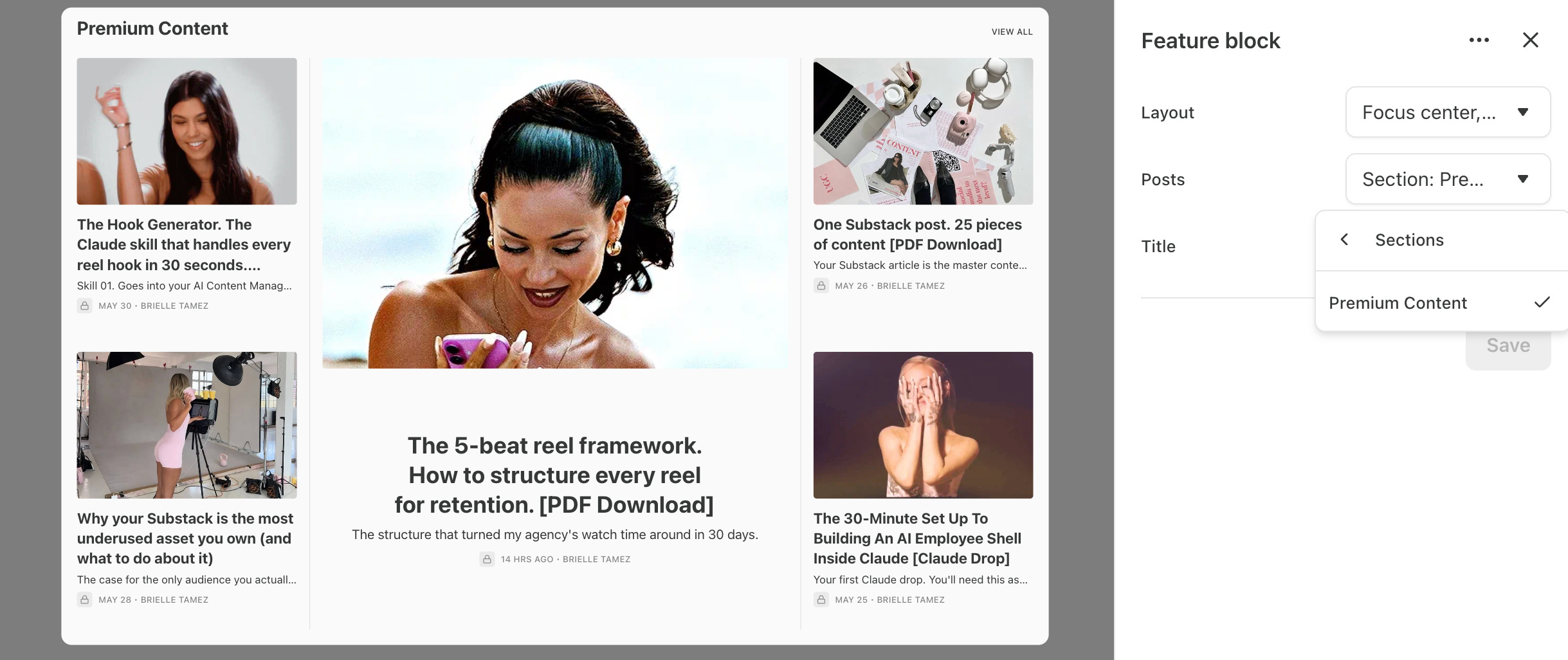
Step 5: To add specific section like your paid content: Add a new block and select feature block. Select Focused center, grid if you want it to look like mine or play around with it!
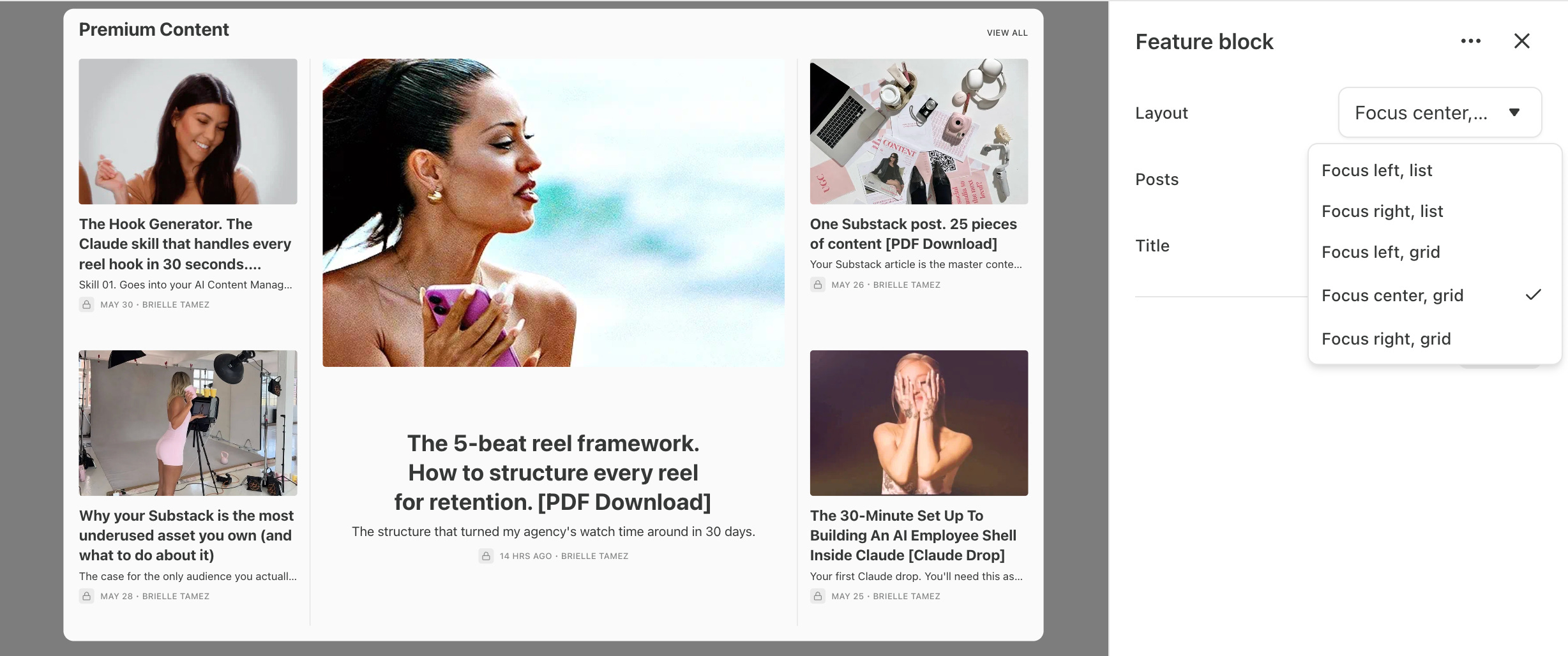
Under posts select your premium content section! Or you can do it based on tags you selected when publishing your articles!
Now let’s talk about optimizing the different pages on your navigation bar! I have three pages on my navigation bar that I’ve optimized! Look on the left under content:
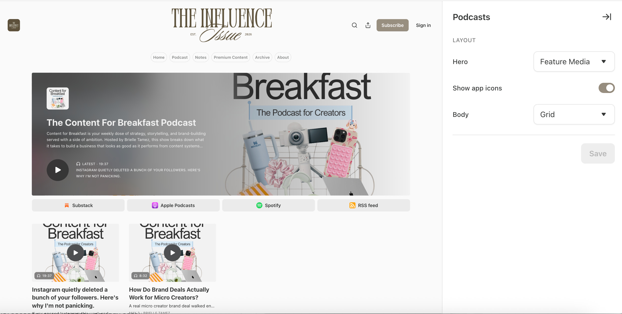
If you have a podcast you can make your podcast page look like this with these settings!
If you have different sections like a premium content section you can make it look like this instead of a list with these settings!